
Services are used to define the connection details and supporting parameters that will determine the data that is retrieved from the data source and displayed in the portal. They are the main building block of displaying data in the portal and the foundation that all other configuration ultimately supports.
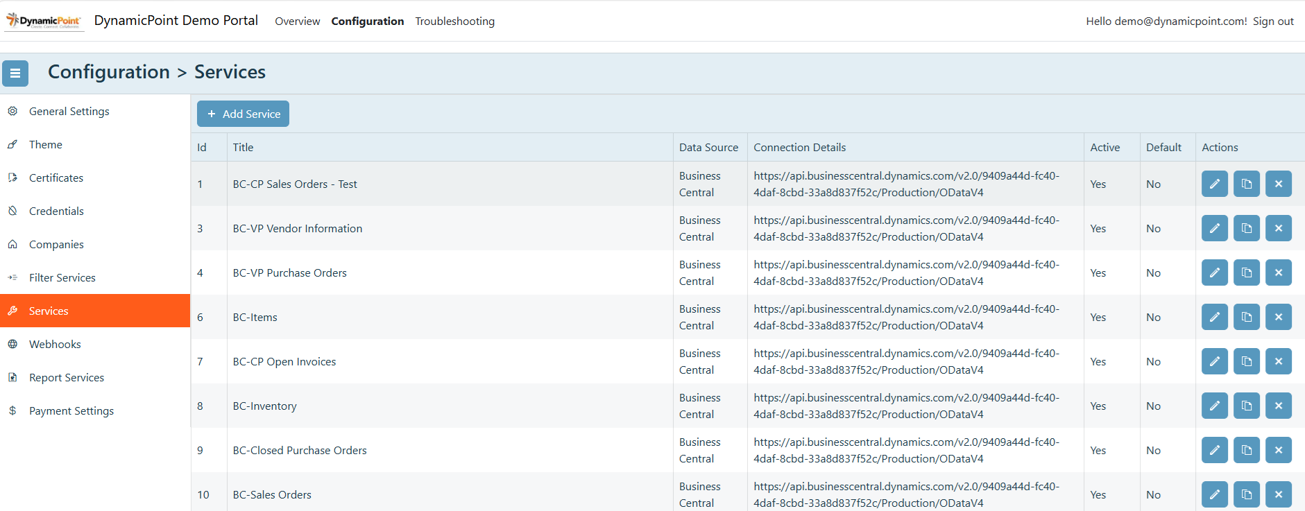
General
The general section of the service creation wizard contains the basic settings.
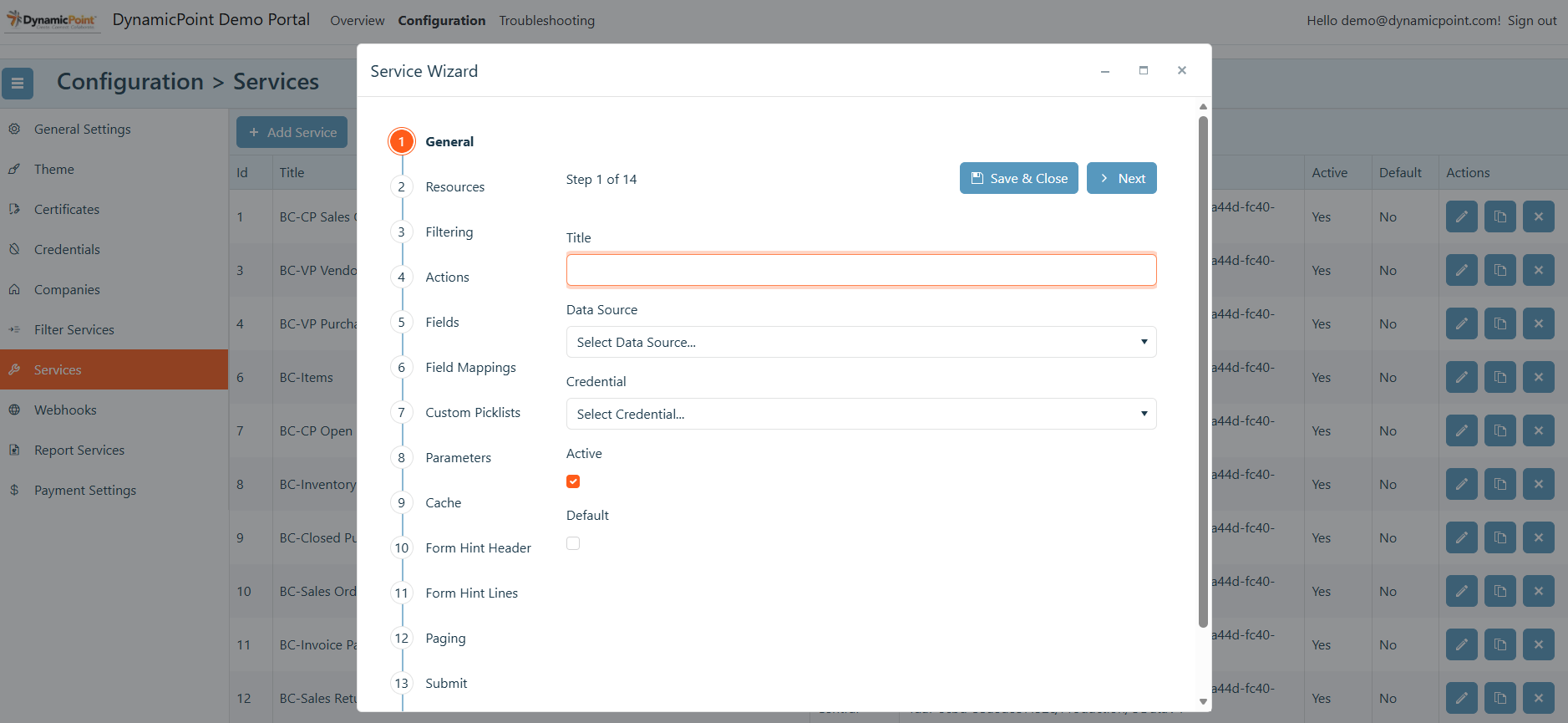
- Title
User defined name of the service. - Data Source
Select the appropriate data source. - Credential
The credential that will be used to connect to the service data source. - Active
Defines if the service is active and shows up in application drop downs. - Default
Defines if the service is the default and shows up automatically in application drop downs. - Service Base URL
The base URL of the API that will be used to retrieve the service data.
Resources
The resources section of the service creation wizard contains the details of the API resource to be used.
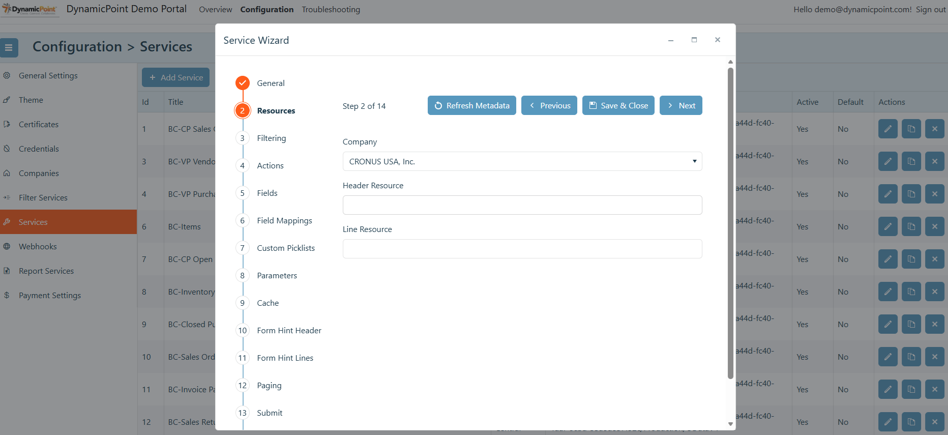
- Company
The previously configured company that will be included in the URL of the API. - Header Resource
The API ODATA resource that will be used to retrieve the header data in the service. - Line Resource (optional)
The API ODATA resource that will be used to retrieve the line data in the service. This is only needed if line items will be included.
Filtering
The filter details section of the service creation wizard contains the details of the filtering that will be applied.
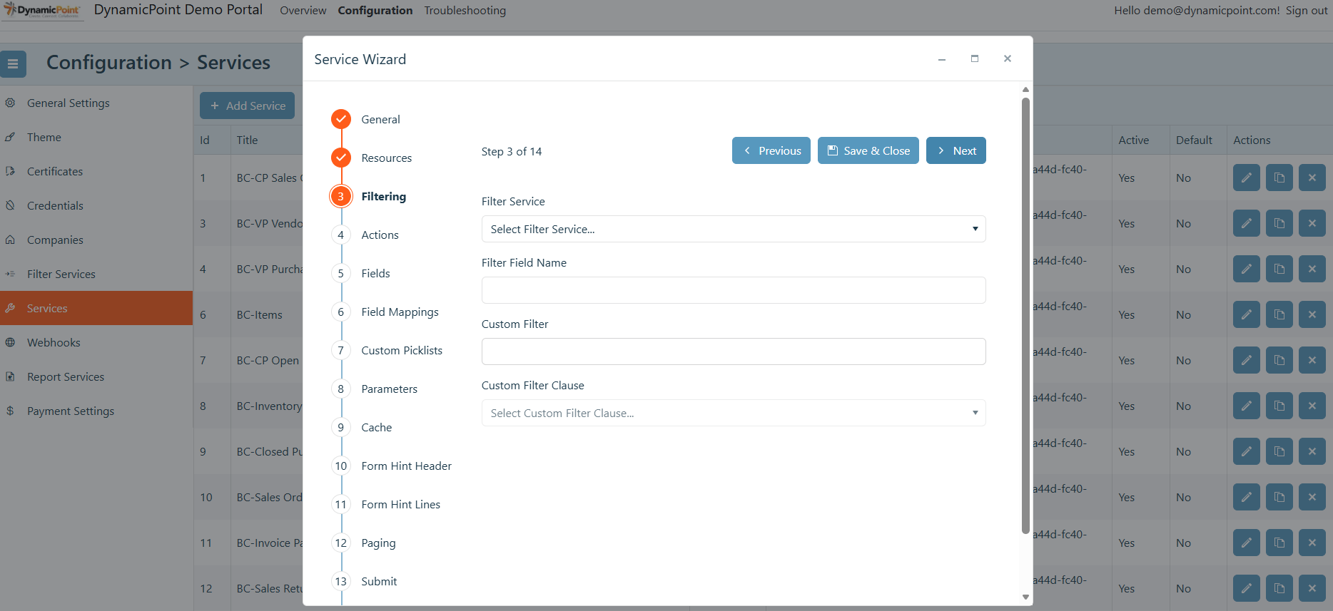
- Filter Service
The filter service of which the filter field will be used for filtering this service. - Filter Field Name
The column on the service of which the filter field will be matched to in determining which records are to be displayed. - Custom Filter
A free text field in which any ODATA filter clause can be entered. - Custom Filter Clause
The join field that will be used to combine the filter field name with the custom filter.
Actions
The actions section of the service creation wizard contains the actions that will be enabled on the configured service.
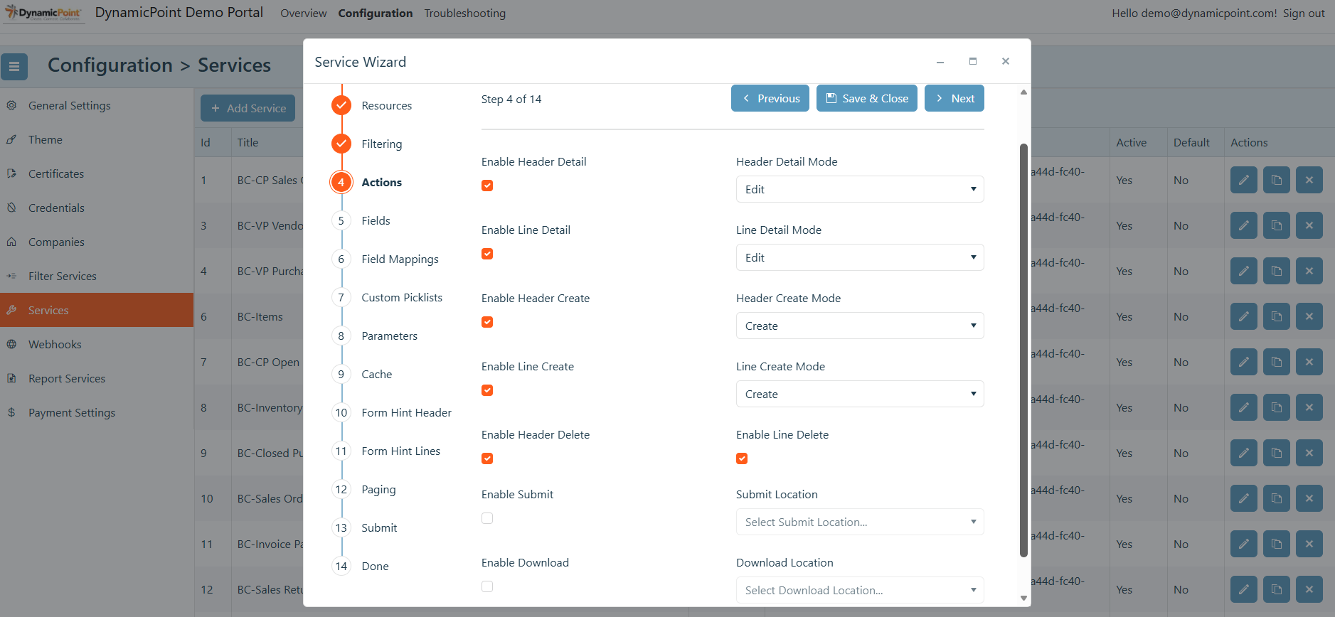
- Enable Header Detail
This will enable a header row to be clicked on to view a detailed pane. - Header Detail Mode
If header detail is enabled, this allows view or edit of the header data. - Enable Line Detail
This will enable a line row to be clicked on to view a detailed pane. - Line Detail Mode
If line detail is enabled, this allows view or edit of the line data. - Enable Header Create
This will enable the creation of data on the header row. - Header Create Mode
If header create is enabled, this specifies the behavior of the creation process. The options are as follows:- Create – The dialog will close after the creation.
- Create and Edit – The dialog will remain open after the creation, and the record just created will be available for editing.
- Create and Continue – The dialog will close after creation and new, blank creation screen, will open
- Create and Multi-Select – The multi-select dialog will open for creation selection.
- Enable Line Create
This will enable the creation of data on the line row. - Line Create Mode
If line create is enabled, this specifies the behavior of the creation process. The options are as follows:- Create – The dialog will close after the creation.
- Create and Edit – The dialog will remain open after the creation, and the record just created will be available for editing.
- Create and Continue – The dialog will close after creation and new, blank creation screen, will open
- Enable Header Delete
Allows header items to be deleted. - Enable Line Delete
Allows line items to be deleted. - Enable Submit
Enables the submission button on the service. - Submit Location
If enable submit is selected, this specifies the location of the submit button.
The options are as follows:- Detail Form – The submit button will show on the detail dialog.
- Grid – The submit button will show on the grid view.
- Detail Form and Grid – The submit button will show on the detail dialog and grid view.
- Enable Download
Enables the downloading of files associated with document libraries. This option is only applicable if the data source is SharePoint. - Download Location
If enable download is selected, this specifies the location of the download button.
The options are as follows:- Detail Form – The download button will show on the detail dialog.
- Grid – The download button will show on the grid view.
- Detail Form and Grid – The download button will show on the detail dialog and grid view.
Fields
The fields section of the service creation wizard allows the selection of fields that will be displayed in the various areas of the service.
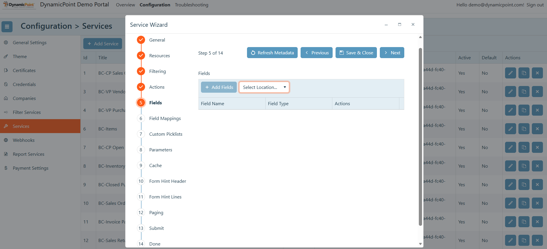
- Refresh Metadata
Queries the data source to get the latest fields that are available for selection. - Select Location
This dropdown will show all enabled sections (as defined by the actions) of the portal service in which fields can be added. This includes Header List, Header List Sort, Header Create Form, Header Detail Form, Line List, Line List Sort, Line Create Form, Line Detail Form.
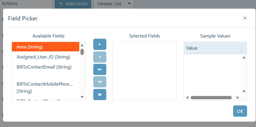
Field Picker
The field picker control allows the selection of fields that are to be added to the various locations of the portal service.
Field Properties
The field property dialog allows the specification of properties for the fields that have been added.
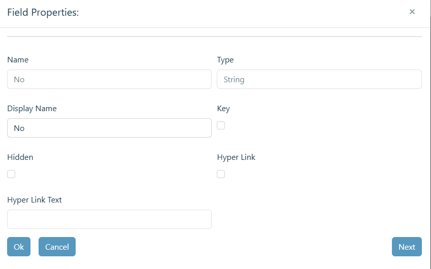
- Name
The name of the column. - Type
The type of data within the column. - Display Name
The display name of the field, which can be changed to be more user friendly. - Key
Denotes the field is a unique key and therefore must contain unique values. - Hidden
Specifies if the field is to be hidden. - Name
This will enable a header row to be clicked on to view a detailed pane. - Hyper Link
Denotes the field is to be displayed as a hyperlink. - Hyper Text
Specifies the text to be displayed over the hyperlink URL.
Field Mappings
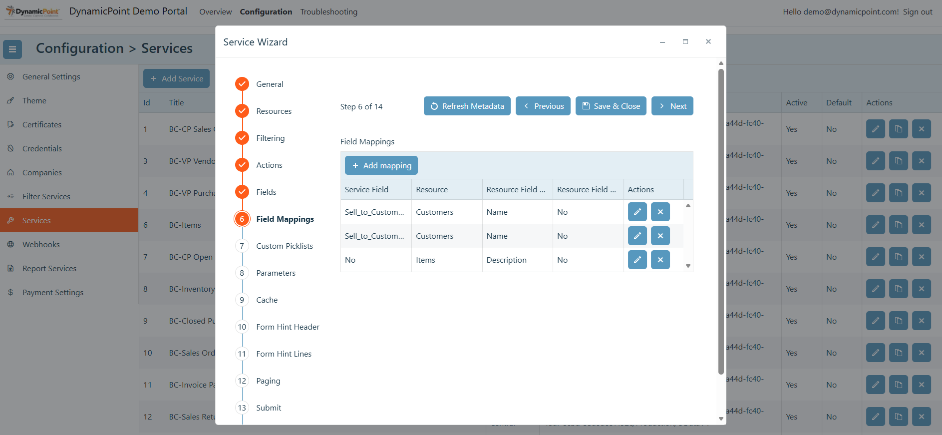
The field mapping section allows the fields that were selected previously to be mapped to separate services for population of dropdown values.
Add Mappings
Click the add mapping button to configure a new field mapping.
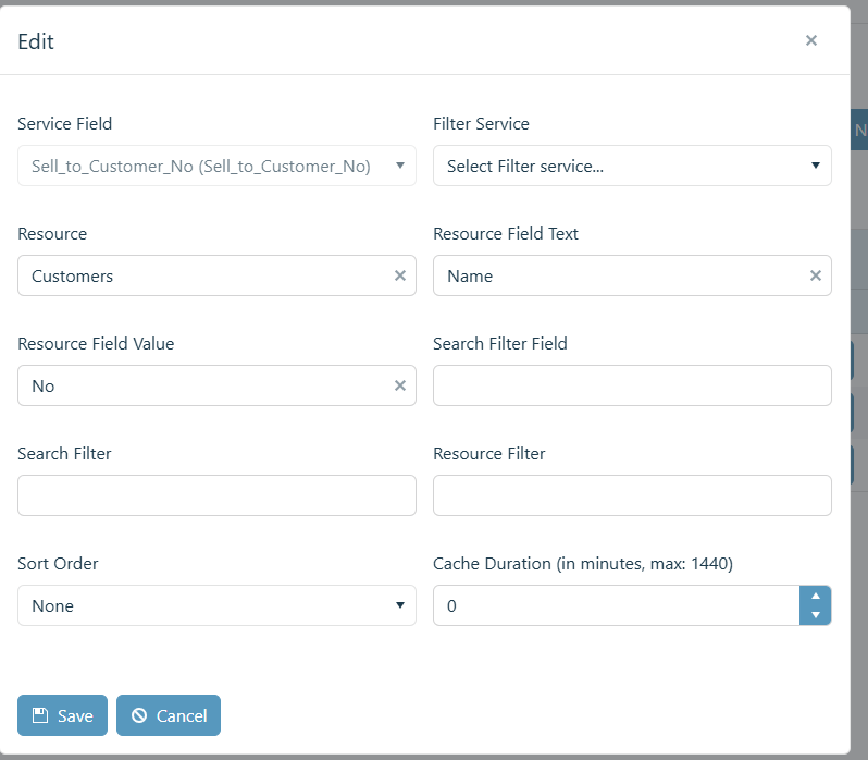
- Service Field
The field on the service on which the mapped field will be applied to. - Filter Service
If the mapped field results are to be filtered by a filter service, it can be selected here (if applicable). - Resource
The name of the API endpoint that will be used to retrieve the mapped field values. - Resource Field Text
The column of the resource endpoint that will be used to display the dropdown value labels. - Resource Field Value
The column of the resource endpoint that contain the values that will be saved for the dropdown selections. - Search Filter Field
Name of the field on which to apply the search filter. - Search Filter
Enables a search to be done on the field values. An example of this configuration is:
substringof ([SEARCH_FIELD_PLACEHOLDER], ‘[SEARCH_TERM_PLACEHOLDER]’) - Resource Filter
Additional optional filter(s) in ODATA format. - Sort Order
How the results of the dropdown will be sorted. The options are none, ascending, or descending. - Cache Duration
Timeout for caching the service in minutes.
Custom Picklists
Unlike field mappings that query a separate API endpoint to determine the values of dropdown fields, custom picklists are static and preconfigured.
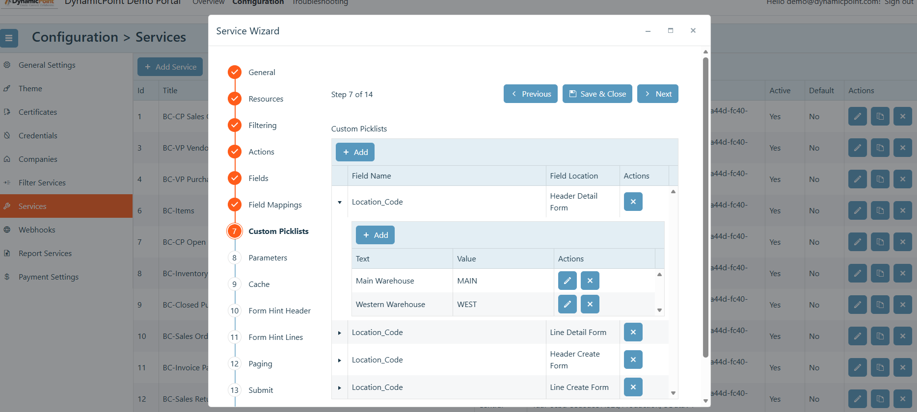
The field mapping section allows the fields that were selected previously to be mapped to separate services for population of dropdown values.
Add Picklist
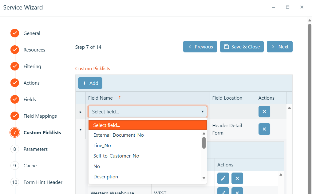
Click the add button to configure a new custom picklist.
- Field Name
The field on the service on which the custom mapping will be applied to. - Filter Location
The location of the field will populate after the field is selected.
Upon adding the field mapping, text and the associated values can be added.
Labels
The Label section allows for standard portal action buttons to be relabeled as well as custom tool-tips to be added.
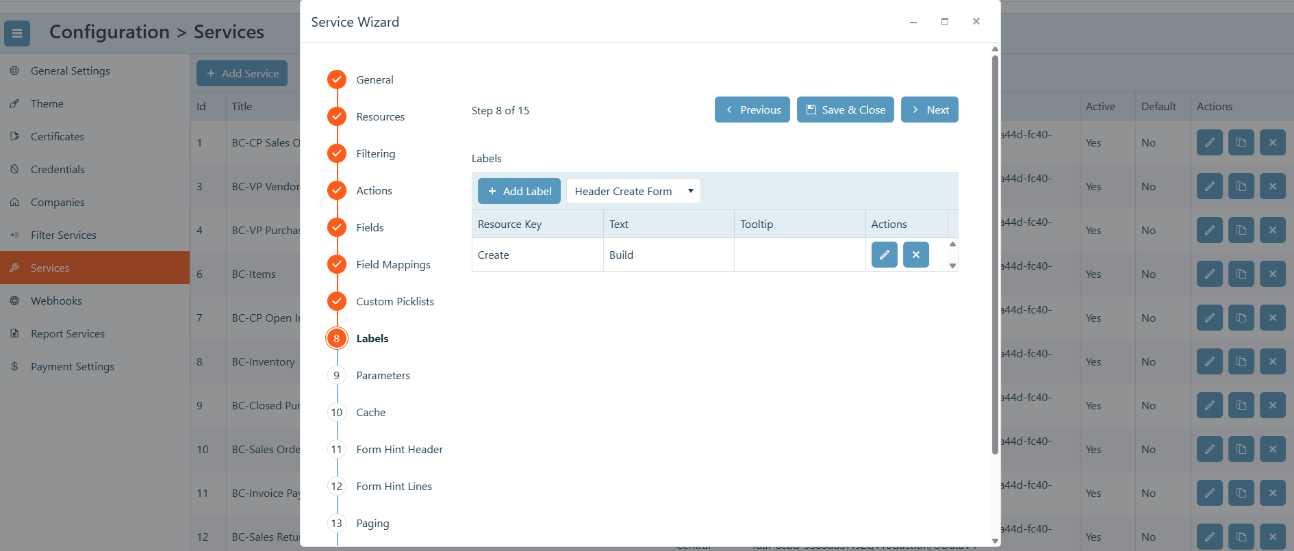
Add Label
Click the add button to configure a new label.
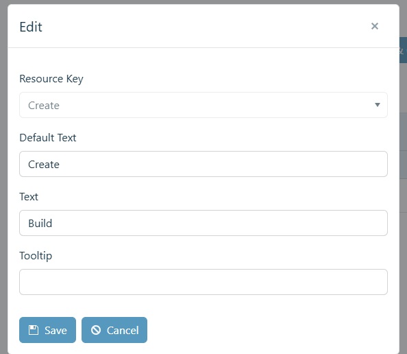
- Resource Key
Select the action or button that is to be relabeled. - Default Text
Will show the default label for the button or action. - Text
The new, desired name for the button or action. - Tooltip
Provide a tooltip that will be displayed when the button or action is hovered over.
Parameters
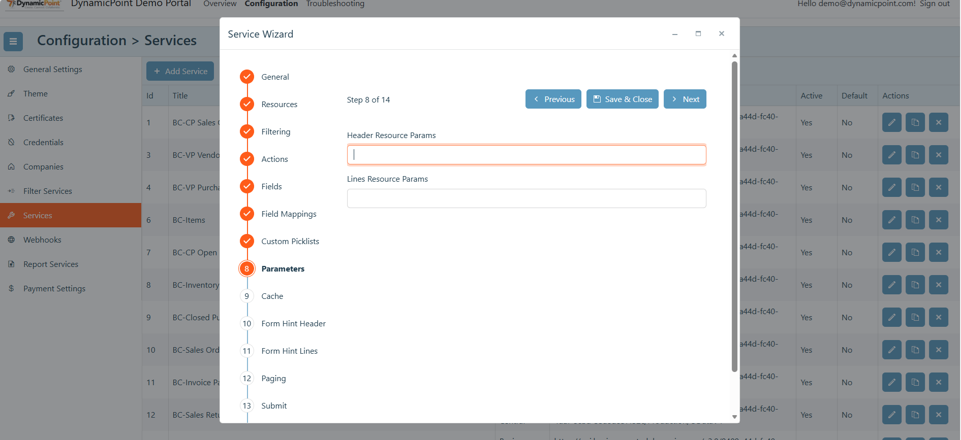
The Parameter fields allow any other ODATA command to be added in querying either the header or line resources.
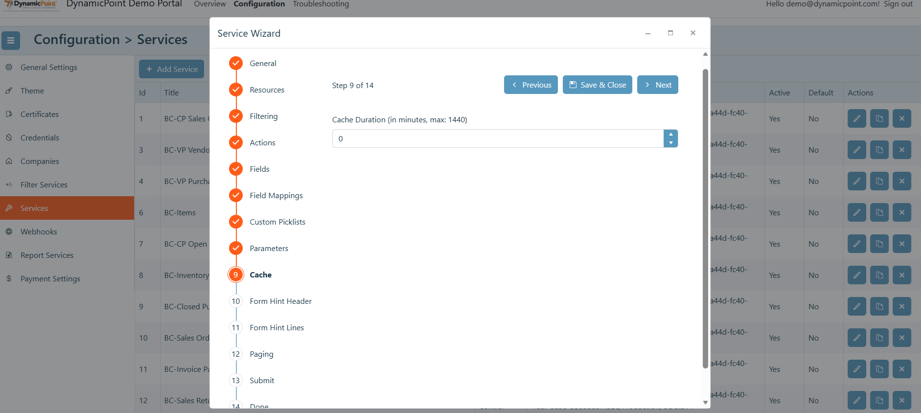
Cache
Timeout for caching the service in minutes.
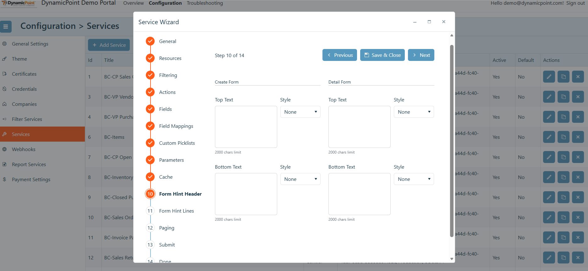
Form Hint Header
The form hint header allows for text to be placed on the top or bottom of header detail or create forms. These can be instructions for the user to help guide them through portal navigation and use.
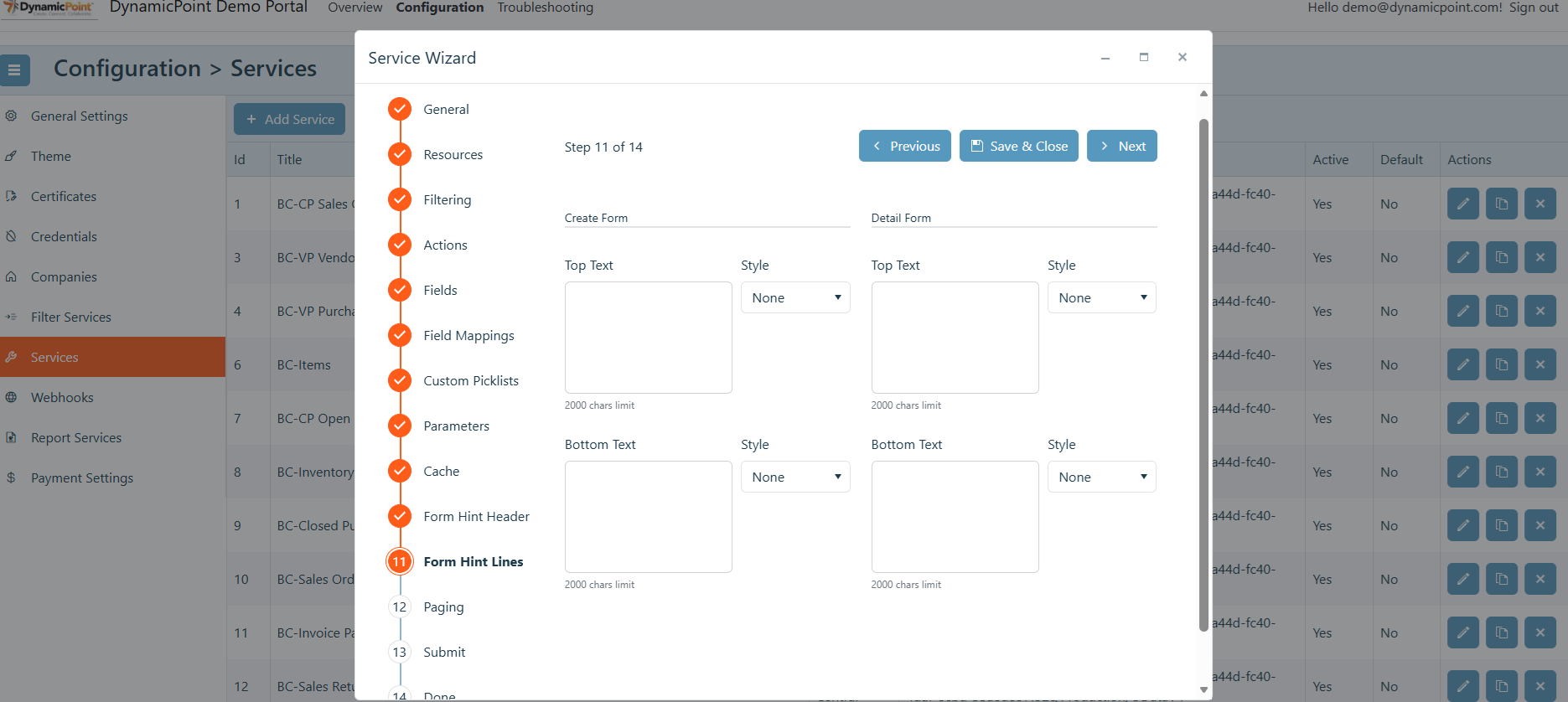
Form Hint Lines
The form hint lines allows for text to be placed on the top or bottom of line detail or create forms. These can be instructions for the user to help guide them through portal navigation and use.
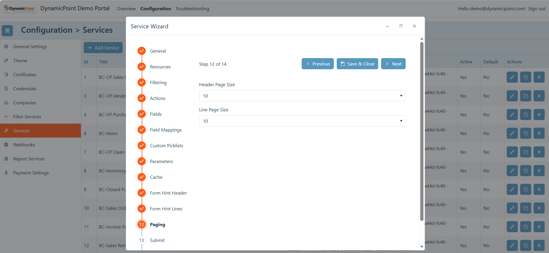
Paging
Number of records that should be displayed in the portal grid, for either header or lines, when rendering the results of the current service.
Submit
The submit section defines the configuration for enabling a submit action on the portal. This section is only displayed if the submit action is enabled in the actions section.
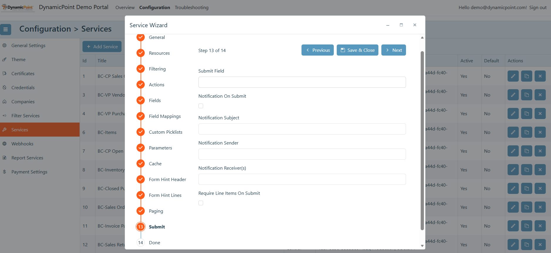
- Submit Field
The field that will be updated when the submit button is clicked. This field must be a Boolean and support true / false values. - Notification On Submit
Enables an email to be sent when the submit button is selected. - Notification Subject
Subject of the email notification. - Notification Sender
From email address of user for notification email. - Notification Receivers
The recipient of the notification email. - Require Line Items On Submit
Requires at least one line item to be added before the submit button can be clicked.